
The Double Dagger – Homage to The Venerable Art of Printing
Time:2018-04-12 From:

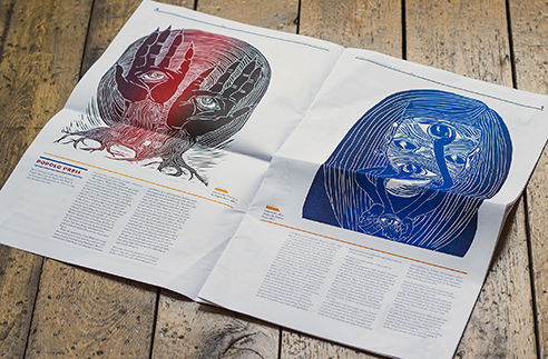
Greetings from The Past
The Double Dagger is a 16pages broadsheet journal printed on an old Heidelberg SBB Cylinder Press from the 1970’s. This press is known as the Rolls Royce of letterpress printing and is famous worldwide for her fast and very accurate printing. The magazine is also entirely printed from hot-metal, wood, and laser-cut types and uses a Monotype Composition Caster from the end of the eighteenth century. Invented by Tolbert Lanston, it made it possible to produce individual hot-metal characters. It was a breakthrough in publishing and printing worldwide, but since the 1980’s it is too costly printing with letterpress. For the Double Dagger team, it is no question why to use these old hot-metal characters. It fits their way of working and represents an integration of the original artists work into the printing process.
Handmade All the Way
Not only the printing process is a time-travel but also the design. All layouts are designed by hand: cut and pasted up galley proofs, which are taken directly from the monotype machine. One of these galleys has over 100 lines of type and needs three pulls to get ready. One pull for the paste-up, second goes to the contributor for a proofreading and the third one is for the designer’s own proof-reader. Of course, digital elements like screens are used, especially for the laser cuttings, but they should only have an assistant role. Using all these crafting-like materials results in having an inbuilt discipline. The self-imposed grid, for example, limits the use of different structures and so the columns in the magazine have all the same width. For their first issue, they used the typeface Caslon with a 48-point bold italic style and later the team said that this wouldn’t have been their first choice if designed by computer, with all the possibilities of the digital world. But they found these constraints very motivational and inspiring as they had to the best with what they’ve got.

Back to The Future
The Double Dagger is like a time-travel, celebrating the good old times of printing. It reminds the reader of how printing changed the world and gives the possibility to experience a more traditional way of printing, a way which becomes rare in the modern world. The depth of colors and the smell of the pages in combination with all handmade setting is unique. If you ask the team where they want to be in five years, their answer is always the same: “Five years!? If we’re still here I imagine we’ll still be standing around the back of that Heidelberg scratching our heads trying to resist the urge to punch each other.”